Overview
Expert is a responsive web design aimed at connecting anyone to an expert in virtually any field any time anywhere. In an age of constant connectedness there are still times when we struggle and have no one to turn to. It may be professional or personal, small tasks or enormous undertakings. No matter what the issue is, we could all use a little expert help from time to time.
My Role
As the UX Designer on this course project I conducted research and user testing, created wireframes and prototypes, and made iterations based on my findings. My design process is outlined in the Inspiration, Ideation, and Implementation phases below.
Duration: Sept. 2019 – Apr. 2020
Tools: pen & paper, Adobe XD, UsabilityHub
The Challenge
Our [advice seeking] users need a way to [simply and intuitively connect to an expert to get help from home or on the go] because [they do not know anyone in their network who can help them].
Potential Solution
A mobile-first app (with responsive web app) that provides a platform for people seeking advice to connect with experts of any field either through free Q&A forums or small fee-based video chat sessions. People can choose an expert based on their qualifications posted on their profile, from reviews of previous sessions with that expert, or they can let the app choose from the next available expert if they are in a hurry or don’t want to choose.
INSPIRATION PHASE
Competitive Analysis
Looking across the web I struggled to find a predominant website or application that offered live expert chats over a wide variety of subjects. Most were specific to their domain and focused on professional help (i.e. tech, business, school). I chose two companies- OnCall and PrestoExperts- that offered the most variety of experts across multiple fields to evaluate for the following UX competitive analysis. I’ve outlined here some of the main findings, but for a more in-depth look check out the Full Competitive Analysis Report that also highlights a full UX analysis of the following sites.
OnCall.me

| Strengths | Weaknesses |
| – Diversity in categories/ specializations – Fast turn around to access an expert – Video and text chat – Filters by location as well | – The app is buggy, sign-in problems, crashes – Not much social media or advertising presence. |
| Threats | Opportunities |
| – “Timeviewer” and “Ask an Expert” apps are similar; however, they are not based in Anglophone countries. – More category-specific apps (e.g. Patch for getting advice from a handyman) | – Better user interface – Better marketing – Building a more active community – Room for growth for iOS, most of the reviews come from Google Play Store |
PrestoExperts

| Strengths | Weaknesses |
| – 24-hour availability – Variety of topics – Tutoring and Counseling seem to be the most used topics – Chat, phone and email – Supported by a large parent company | – Non-responsive design – Not well advertised – No social media presence – No active community |
| Threats | Opportunities |
| – Local tutors that can be in person and see what you’re working on – Counselors that can meet in person | – Video Chat – App version – Better marketing to create more awareness overall – Highlight other experts (handyman etc.) |
User Interviews and Analysis
After taking to the web I took to the streets. The following details the information that I gleaned from user surveys and interviews that I conducted.
Research Goals
- Determine ways users would discover an app like Expert
- Find opportunities to gain a user’s trust to begin and continue using the app
- Collect data on contexts in which users would use the app
Survey Data and Findings

| Information | Insights |
| 27 participants Average age : 37 78% women – 22% men Average education: Bachelor’s | This gave me parameters on who to focus my designs |
| Most people said they would do research on their own (blog/ articles/ YouTube) before considering hiring a professional, but would consider paying a small fee to get help. | This gave me inspiration on what types of content would be most helpful to offer within the app and formed the business model of paying small fees for Expert help |
| Everyone said they use customer reviews but with caution and preferred referrals from friends to make their decisions. A large part said they look for certifications when hiring help. | This confirmed the types of information that people expect to find when hiring a professional. |
| More people seemed willing to use an expert for professional advice over personal advice; however, when asked about specific subjects the more personal topics (physical health, finances, and counseling) received more yeses than the more professional (skills and business). | The breadth of topics that this sort of app could cover is infinite. This information allowed me to focus on a category that a majority of users are interested in. |
Interviews
Since the average age of users targeted for the app are in their mid-thirties, I reached out to my social network for user interviews. I conducted 2 in-person interviews and 1 remote to get a better understanding of my research goals.


Key Findings and Takeaways
The Obvious, the not-so-surprising…
- Groupings happened naturally based on the questions I had asked during the interviews – how did you find your latest app? How do you feel about reviews etc.
- Most were interested in getting help with personal finance questions
- A mix of people wanted to be able to call a person for help vs just texting them
- Most rely heavily on reviews and referrals when buying a product or service
What I Didn’t Expect…
- People’s overal mistrust.
- Most rely on reviews; however, they all admitted that they didn’t actually trust them.
- They would spend loads of time reading and analyzing reviews (were they 1 or 5-stars?, when was it posted?, was it one of the first 100?), but ultimately would just end up settling on something.
- A personal referral trumped all reviews and certifications.
The personal referral eliminated the anxiety and frustration of sifting through hours of impersonal reviews wondering if they were legitimate or paid-for. By getting a personal referral people knew what they were getting- a vetted pick from a trustworthy source.
I assumed people would also use certifications and accreditations, and they even agreed; however, when pressed for specifics they couldn’t recall a time when they actually ever did this. People also claimed that they do not trust any app, yet they will use “the apps that everyone else uses” and trusts (Facebook, Google, Amazon, etc.).
Ideation Phase
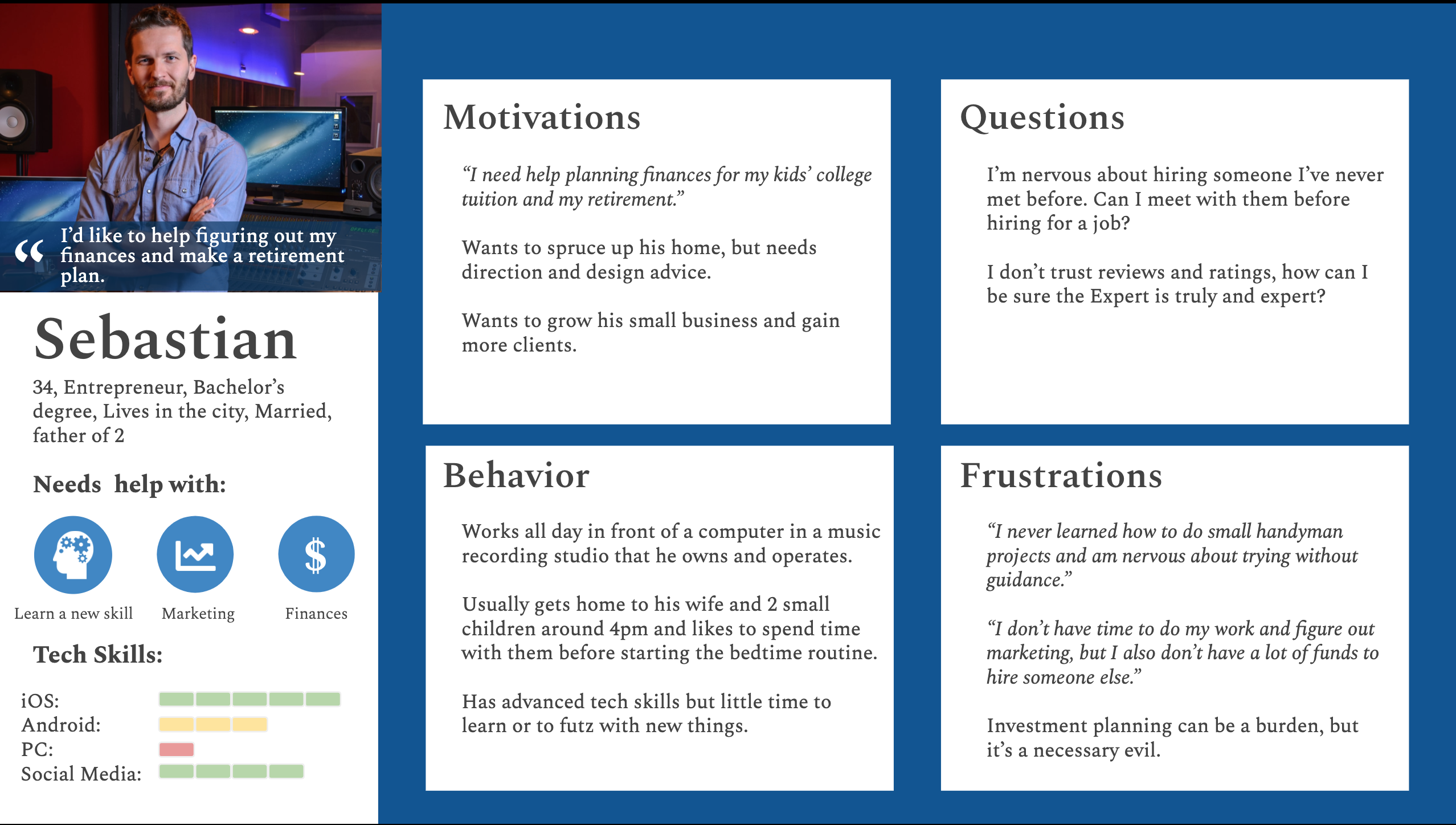
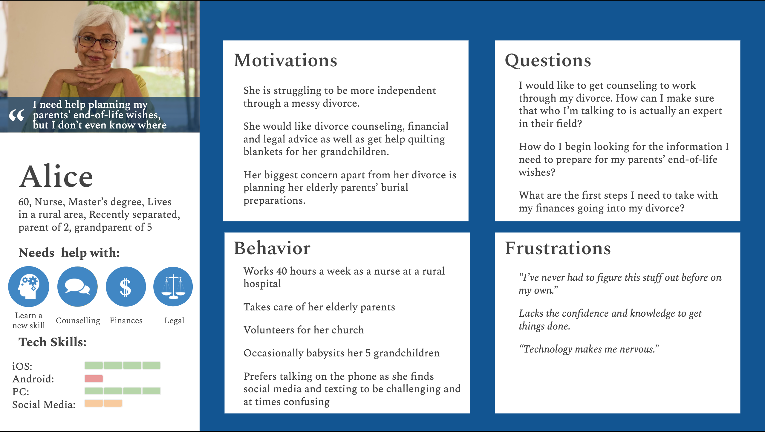
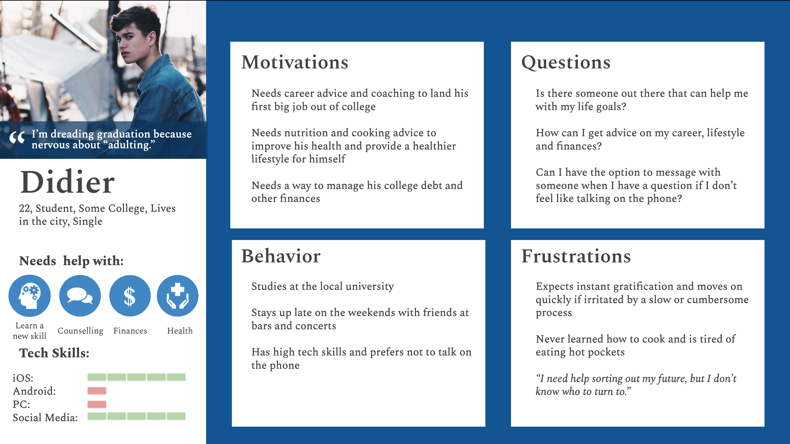
User Personas
I created three unique personas to help synthesize the data I collected during the inspiration phase and guide my designs going forward.
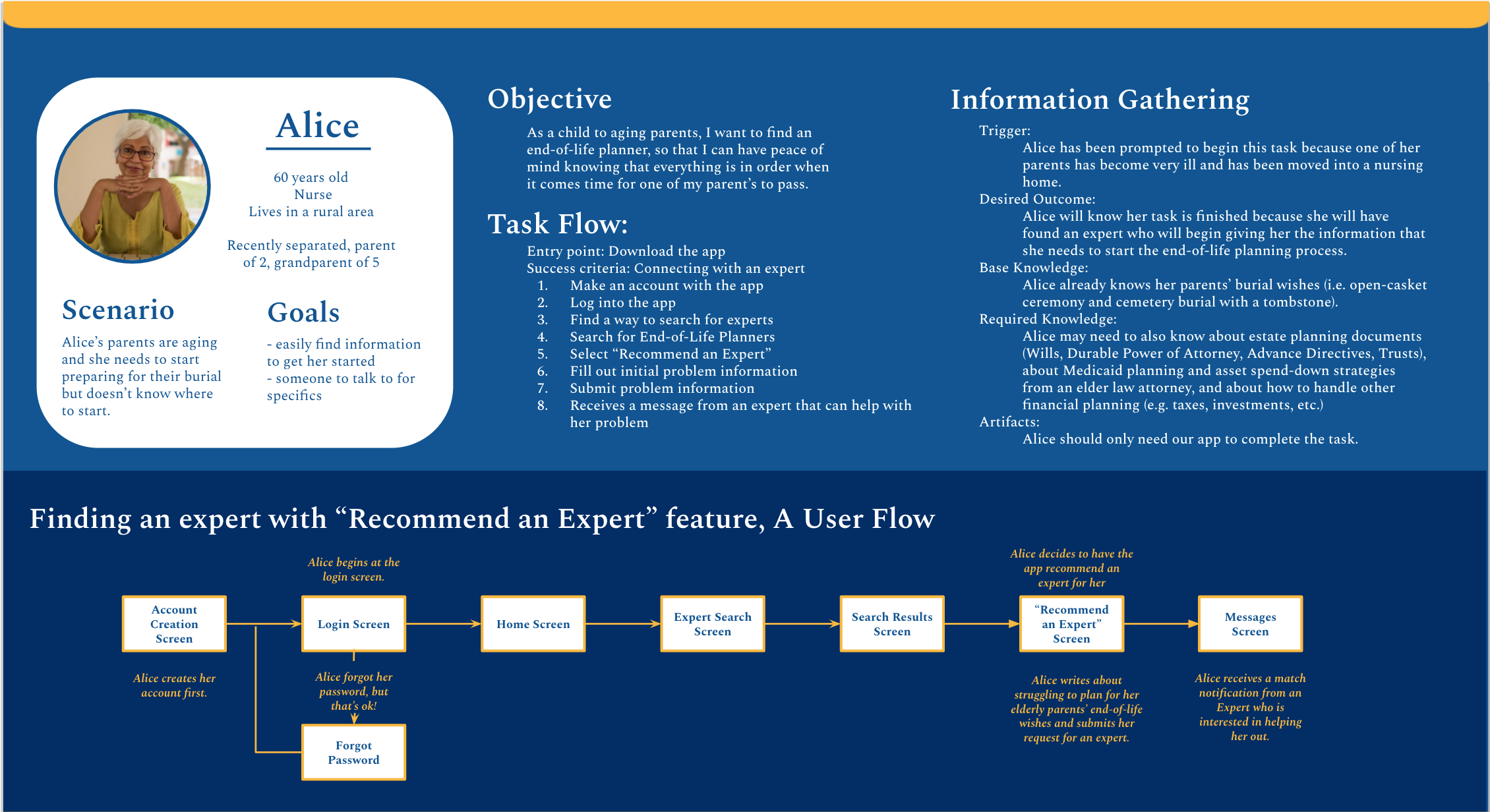
Journey Mapping
I created these maps to get more in the mindset of the user (doing/ thinking/ feeling) to then glean out opportunities where I could design better experiences.


User Flows
Next I broke down tasks into potential screens needed for each persona. This guided me on what pages would be necessary to start building the app’s information architecture.


Implementation Phase
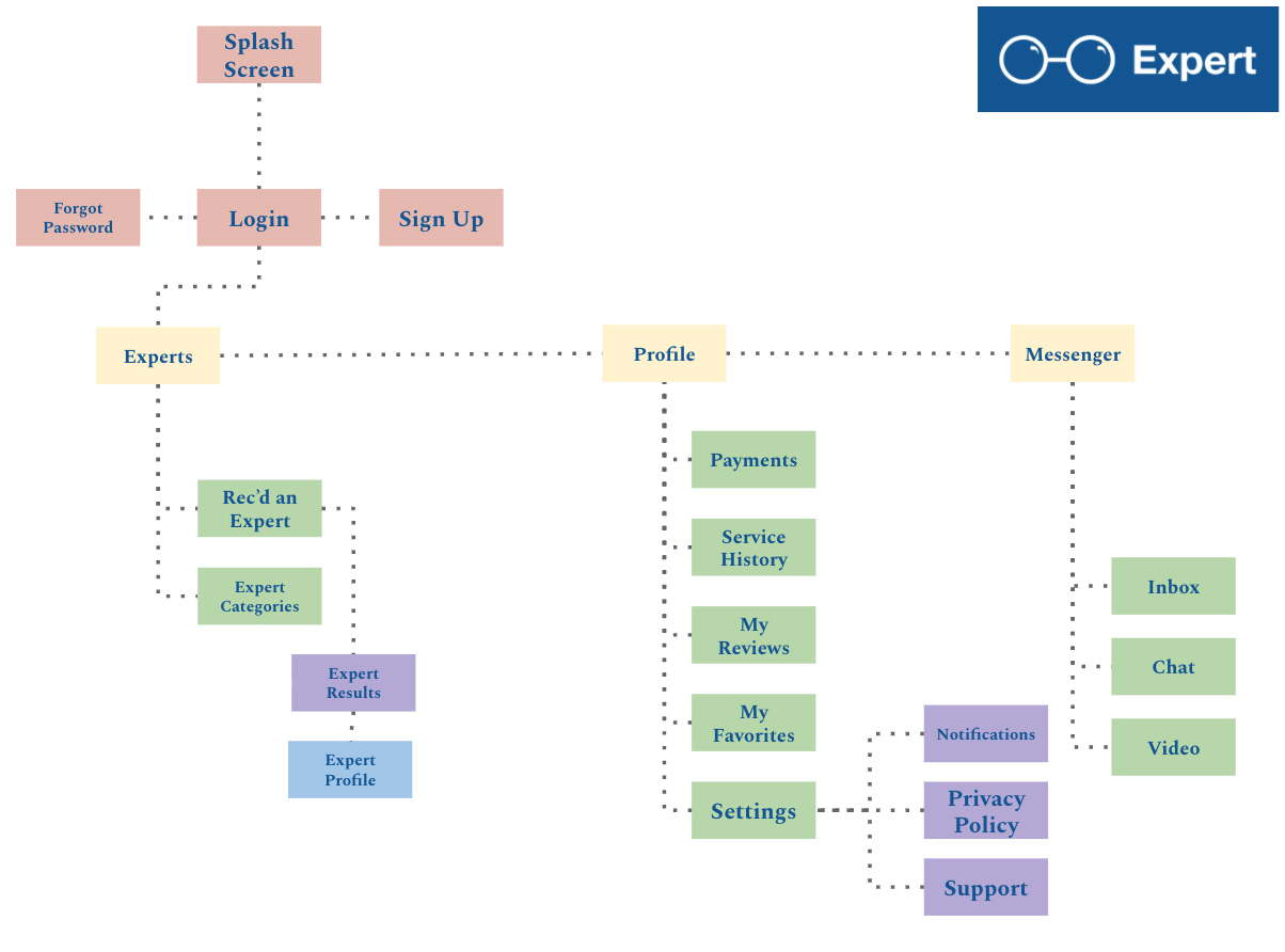
Information Architecture
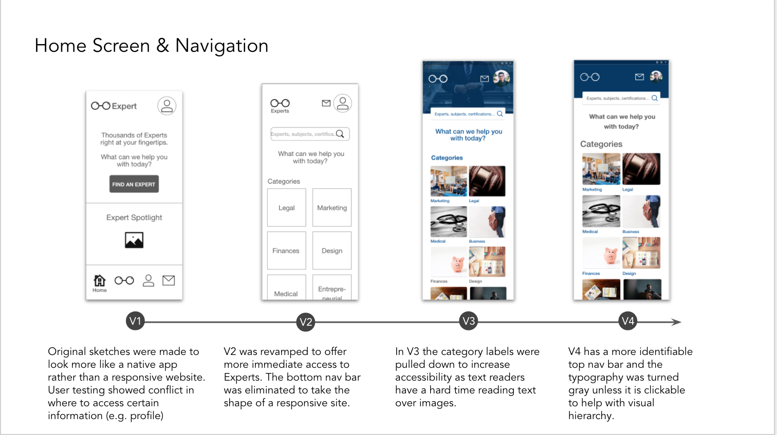
I went through a few iterations of the IA for the app before finally settling on the design on the right. I ultimately decided to clean up the pages a bit to help simplify the app’s navigation because during the testing phase I discovered it was a bit too convoluted.

Beginnings
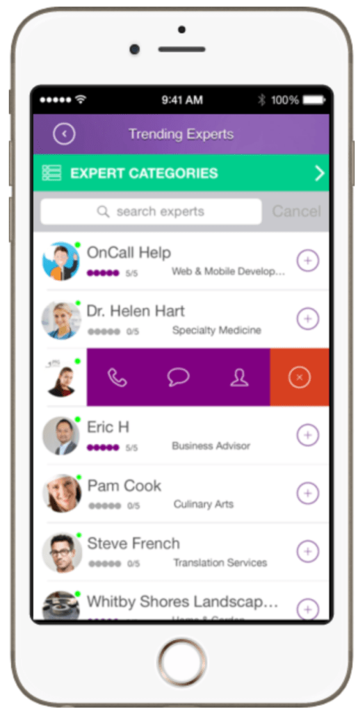
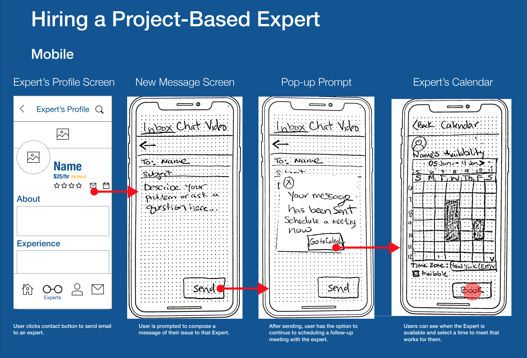
The following are the beginning stages of the app’s design. I started with pen and paper and moved to LoFi wireframes for user testing. The images below show a few original flows. The “Recommend an Expert” flow got the most overhaul in the end and the “Hire an Expert” flow stayed relatively the same with some minor tweaks. See the next section for iterations on these flows.


Usability Testing
I conducted 6 in-person moderated testing with a low-fidelity MVP in order to gain feedback and assess my designs before getting too far in the weeds. To see details of my results,
scripts and findings follow the links below.
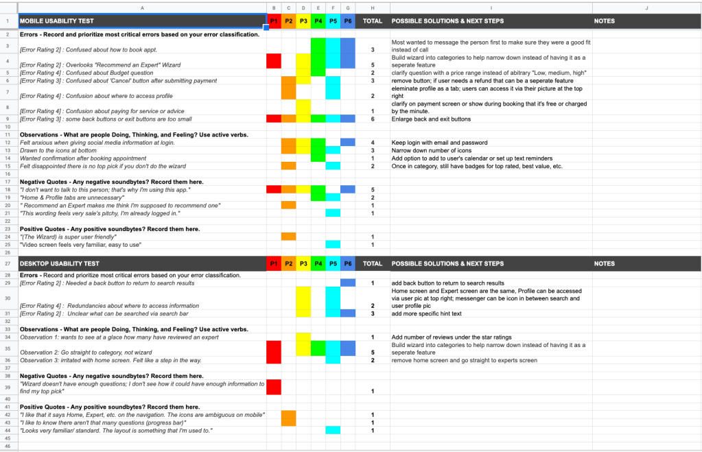
Connecting the Dots
To synthesize my testing results I put all of my data into a rainbow spreadsheet (left). I organized my findings in order to inform and prioritize my next iteration.

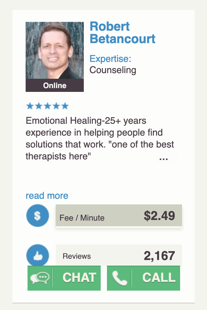
Getting to the Good Stuff
The image to the left is a detail from The Full Report I created from my usability testing. It outlines the script, plan, results and iterations.
Iterations and Ameliorations
Using these results from the usability test, I got to work fixing issues (see details below) and developing a high fidelity prototype.


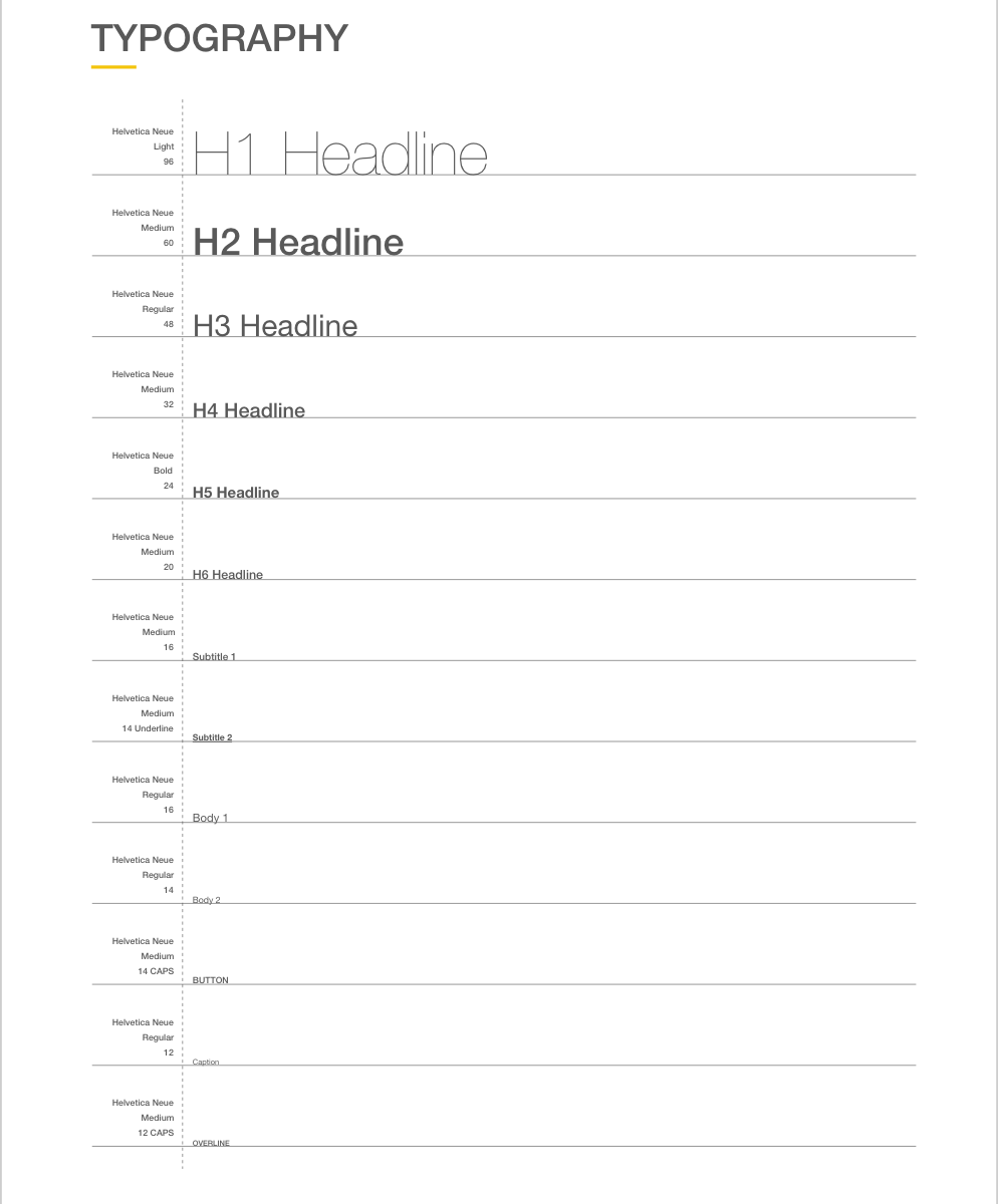
Style Guide
The style guide below was created to depict Expert’s professional but friendly feeling. These are just a few aspects of the guide that I chose to highlight, but check out The Full Style Guide for a more details.


Future Iterations
Users want to get back to their busy lives and don’t want to spend a bunch of time researching the perfect product or service for themselves; however, they also want to feel confident that the choice they’ve made is in their best interest. To relieve this burden of choice I propose perfecting an AI chat to help quickly and efficiently narrow down a user’s best choice of expert for their unique situation. I predict that it will increase booking and engagement with the app.
For future iterations I would want to collect data of who used the “Expert Expert” AI chat and how many successful bookings are made. I would want to refine the onboarding process to gather more background information on the user as well as enable the chat to ask more questions throughout its interactions with a user. This will hone the chat’s capabilities thus simulating the personal referral that users ultimately rely on when seeking professional help.
Walkthrough
To see the prototype in action watch the video below or launch the prototype for a hands on experience.

